The Trade List Report shows every trade that was taken as part of the trade simulation.
Step: Click on the ‘Trade List’ icon in the trade simulation navigation bar
Trade Simulation Navigation Bar – Click on Trade List
You should see the following Trade List report
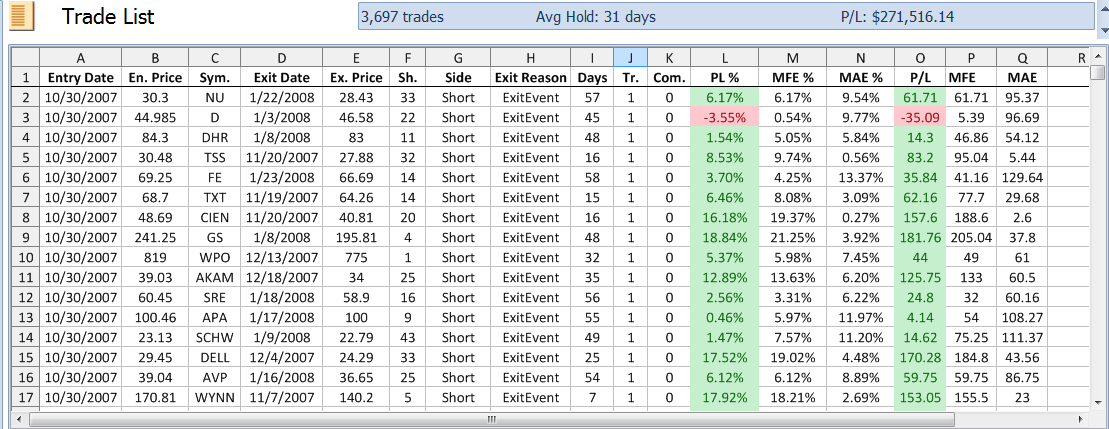
Trade List Report
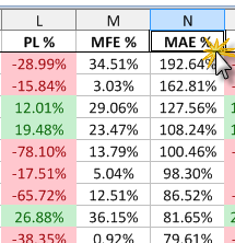
The Trade List report shows you the date and price that each trade was entered and exited. The number of shares traded are shown along with the days held and the reason for exit (in this case most trades are exited because an exit event (signal) was hit). Each trade also shows the Profit/Loss and Maximum Adverse and Favorable Excursions both in percentage terms and dollar figures.
This is a highly interactive report allowing you to sort on any of the columns and view the security chart for any of the rows showing the annotated entry and exit points.
Task: Sort the report by PL%
Step: Click on the table header ‘PL%’
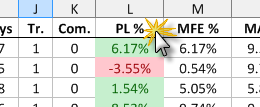
Click on PL%
You will see the report is now sorted from lowest PL% to highest PL%.
Click again on the header ‘PL%’
You will see the report is now sorted from highest PL% to lowest PL%
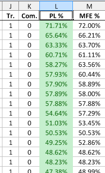
Trade List sorted by highest to lowest PL%
Task: View the annotated charts for the simulated trades in the trade list
Step: Double-click on any cell in the row containing the symbol ODP
A pop-up chart appears showing the exact entry and exit points and the exit point annotation also shows the reason for exit (in this case the reason was that the exit event (signal) was hit).
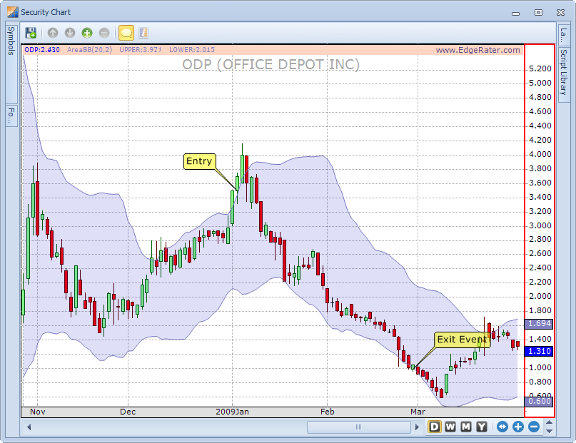
Chart showing the entry and exit points of one of the trades in the simulation
Note that the entry was at the open price of the day after the stock crossed its upper Bollinger Band and that the exit was at the open price of the day after the stock crossed its lower Bollinger Band. This was dictated by the simulation settings choices made earlier. The simulation settings were to go short the stock and this particular trade turned out to be the biggest percentage gainer at 71% profit.
Task: Quickly scroll through the charts of all trades in the trade list.
Step: Press the down arrow key on your keyboard to view the chart of the next most profitable trade. Also locate other trades in the list and select them by clicking on any cell in the row. The chart will automatically update to show the annotated entry and exit points.
Task: Locate the trade with the largest MAE (Max Adverse Excursion)
Step: Click on the MAE% column header twice to sort the list by largest to smallest MAE%
Trade List sorted by largest to smallest MAE%
Task: View the annotated chart of the trade with the largest MAE%
Step: Double-click on any cell in the row with the largest MAE%
You should see a chart similar to the following:
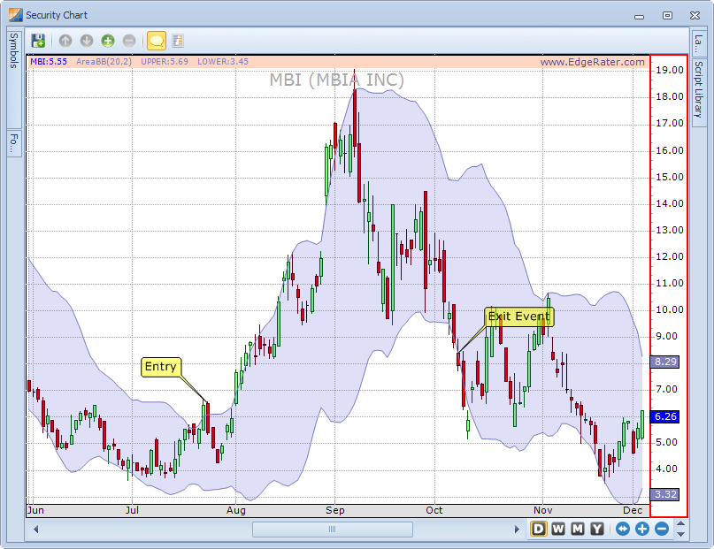
Trade with the largest Maximum Adverse Excursion percentage (MAE%)
This kind of individual trade information is extremely important because it shows you the maximum pain point of a trade and allows you to determine if a particular trading system fits your trading style and money management system. For instance, in the chart above even though the trade ended up only 29% down, at one point during the trade it was 192% down. This is possible because the strategy under test is a shorting strategy and in theory losses on an individual position are unlimited (although there are ways to define your risk in these types of systems).