The Next N Bars report shows a graphical statistical summary of all of the trades in the simulation.
Step: Select the ‘Next N Bars’ report from the trade simulation navigation bar
Trade Simulation Navigation Bar – Click on Next N Bars
The following report will be shown:
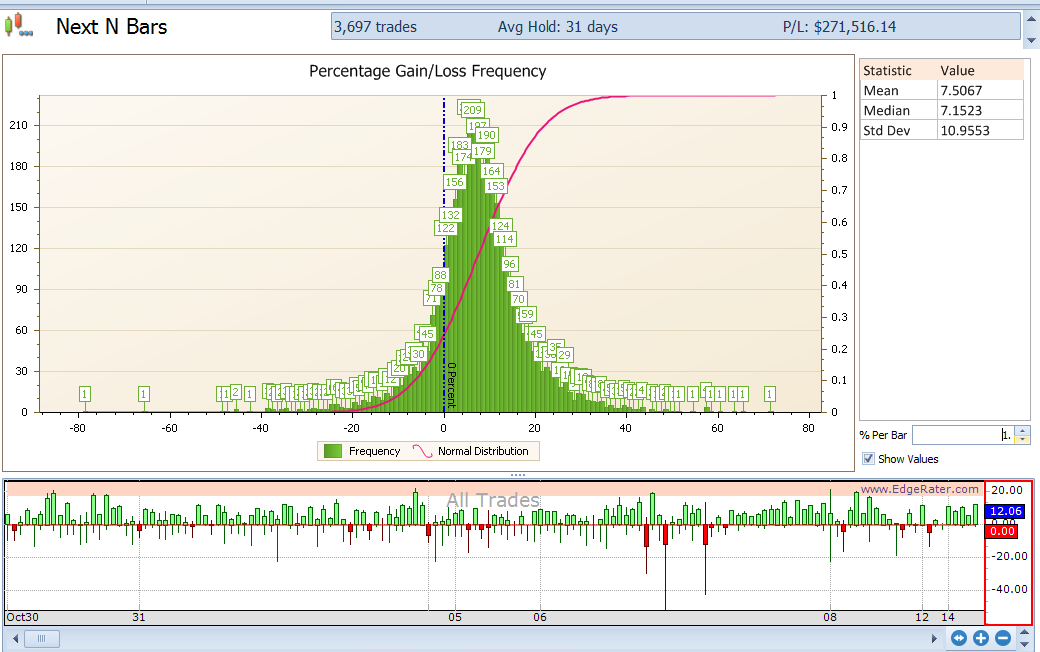
The Next N Bars report
The upper part of this report shows a histogram with the frequency of winning and losing trades. The vertical blue bar in the center of the chart is the zero percent line. Green bars to the right of the blue line represent winning trades – the further to the right the greater the percentage win. Green bars to the left of the blue line represent losing trades the further to the left the greater the percentage loss. The height of the green bars represent the number of trades that fell within that range (or bucket).
The default bucket size is 1% but it will be less cluttered if you make the buckets larger.
Task: Make the bucket size 4%
Step: Change the % per bar value to 4.
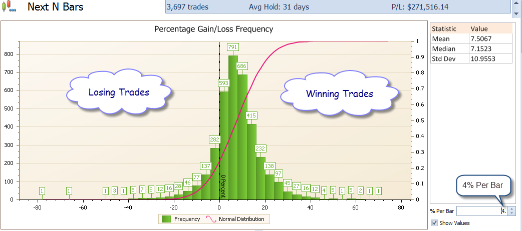
Next N Bars report with 4% bucket size
Note that the majority of the trades fall on the right hand side of the chart and so there were more winning trades than losing trades. Also note that the most populous bucket is the 4-8% gain bucket. At a glance you can see the overall performance of trades in the trade list. The largest losing trade was around 80% loss and the largest winning trade was around 70% gain (you can also see this by looking at the trade list and sorting by PL%).
The lower chart shows one bar per trade and you can visually identify the PL%, MAE% and MFE% numbers.
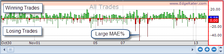
Lower chart in the Next N Bars report showing all trades