
The new EdgeRater trading template for July 2015 is the Jeffrey Scott Shorting template. Jeffrey recently requested that I put together a template that would help find stocks to short. His current method of finding those stocks is to manually look through charts that contain his desired indicators. This new template offers a simplified way of bringing those candidates to his (and your) attention very quickly.
I asked Jeffrey to write a short description for the front page of the template and I have repeated it here:
 “Shorting stocks is as much an art as science. Gil Morales has recently written an excellent book about shorting which has stimulated my interest in finding stocks to short. One of the things that I learned from Gil was to look for stocks that were leaders and now failed. In addition to various chart patterns such as Head and Shoulder, often these stocks fail at major moving averages. Couple this with the finding years ago by Chris Wilson, an active particpant in the HGSI community, that on a weekly chart, when leaders rolled over you often found that this was accompanied by a relative underperformance (RS) of the issue vs the SP500. Lastly, as part of the gang of 5, we created a timing indicator called BONGO that often gave a sell signal on a weekly view as stocks became shortable. For this template, I have asked Chris White to help me scan for these key findings on a daily or weekly chart –> RS underperformance vs SP500, failure at major moving averages, BONGO weekly turning to sell signal. My hope is to find shortable candidates early after they have topped and turned to the darkside“. Jeffrey Scott
Relative Strength – a New Method
Development of this template also necessitated finding a better way to calculate the Comparative Relative Strength of a stock vs. any other symbol.
Comparative Relative Strength (Comp RS)
Comparative Relative Strength (RS) is often calculated by dividing the price of the desired security by the price of another symbol (usually the S&P500 index or proxy such as SPY) and then multiplying by some constant factor to arrive at an RS value. These values represent a ratio between the stock’s price and the comparison symbol’s price.
The RS number given by the above method is meaningless on its own and only has meaning when compared to past numbers. The general direction and shape of the RS line pretty closely follows the general direction and shape of the stock itself (take a look at any stock chart and add the CompRS indicator to prove this to yourself). Therefore if you try to determine underperformance by adding a Moving Average to the CompRS line and looking for crosses below the moving average you are no better off than just looking for crosses of the stock below its own moving average.
Investopedia has an interesting article on Relative Strength describing an alternative calculation. Here’s an excerpt:
“… take the six-month rate of change in an investment’s price and divide it by the six-month rate of change in a relevant index. The investment’s rate of change is divided by the benchmark’s rate of change to get a relative strength value. If the value is greater than one, the investment is relatively strong; if the value is less than one, the investment is relatively weak…”
Thereby yielding a value that does have meaning on its own. The problem with that approach is that “Rate Of Change” actually just means % change over a period of time and if that change is 0% (as it is very frequently) dividing by zero gives an infinite number!
Rate Of Change Relative Strength (ROC RS)
My solution is to take part of the above approach and instead of dividing by the benchmark’s rate of change, subtract the benchmark’s rate of change to arrive at a % number. The number represents the under or over performance of the investment. I have called the resulting indicator the ‘Rate Of Change Relative Strength’ or ROC RS.
For example:
Stock ROC: 10%, Index ROC: 0%, ROC RS: 10%
Stock ROC: -10%, Index ROC: -5%, ROC RS: -5%
Both the CompRS and ROCRS indicators have been added to EdgeRater and can be dropped into any chart.
Here’s an example of both indicators applied to a weekly chart of Apple (AAPL)
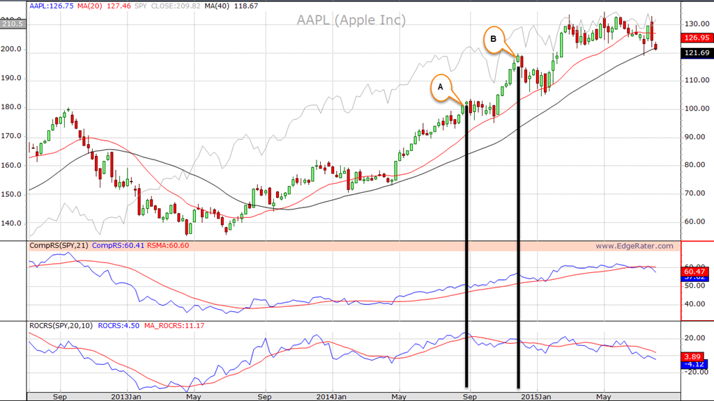
Weekly Chart of Apple (AAPL) showing both CompRS and ROCRS indicators.
You can see that the CompRS indicator generally follows the shape and direction of AAPL and gives numbers that are meaningless by themselves. The Moving average of CompRS also tends to cross at the same time as the same period moving average of the stock. However it is useful to compare distinct points in time such as the peak back in September of 2012 with Point B where you can see that the AAPL was relatively stronger that SPY back then than at point B.
The ROCRS indicator gives numbers that are useful by themselves. For instance you can see that at point A AAPL did just over 20% better than SPY over the prior 20 bars (we are using a 20 period lookback for the indicator in this example). And at point B where AAPL was higher than at point A, it was actually less than 20% better than SPY over the prior 20 bars. Numbers that are greater than 0% for ROCRS indicate outperformance and numbers that are negative indicate underperformance. A moving average is applied to ROCRS to try to get an indication of when the performance is changing direction. You can adjust the third parameter for the indicator to change the moving average period.
The Shorting Template
Having got past the new indicator introduction, let’s look at the shorting template.
Download the Sample Report Here
Here are the settings that you can change prior to running the template:
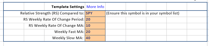
Template Settings
And here’s an example report produced with the default settings:
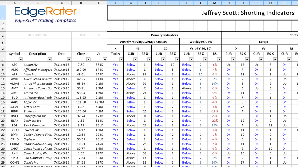
Interactive report produced by running the Shorting template
Primary Indicators
The first few columns (E through L) contain the primary indicators which are weekly moving average cross and weekly ROC RS cross information.
The two default weekly moving averages are the fast average set to 20 weeks and the slow average set to 40 weeks.
Column E indicates if price has crossed below either of those moving averages today. So for example you can see that AMAG has crossed below one of the moving averages today and then looking to the right we can see that it crossed below the 20 MA but is still above the 40 MA. BS X stands for ‘Bars Since Cross’ and is useful for quickly seeing how long ago the moving average was crossed without having to pull up a chart.
Columns K through N show the weekly ROC RS position. Firstly whether it is above or below the Moving average and then column L indicates how many bars since it crossed either above or below. So for example we can see that BUD is currently under performing the SPY by 3% and the ROC RS value crossed below the MA of ROC RS 3 bars ago. Remember that RS numbers that are negative indicate the stock is underperforming the index.
Confirming Indicators
Bongo
The next set of columns N through Y contain confirming indicators and the first confirming indicators are the Bongo Daily, Weekly and Monthly, again indicating the state of the Bongo signal and how many bars ago it crossed to that state. Bongo is an indicator that was developed by a group of experienced traders at an HGSI trading seminar a few years ago. It detects when 3 different Wilder’s RSI numbers start stacking coupled with price in relation to a Moving Average to indicate the current momentum in a stock. When the Bongo is in a Down state the stock is showing signs of weakness. It is useful to watch for the times when the Bongo crosses from Up to Down and Vice Versa. The daily Bongo cross is usually the first sign of a change and the Weekly Bongo cross is confirming. Monthly is not normally used but has been added here for extra power.
Kahuna
After that there a set of columns for the Kahuna indicator (Daily/Weekly/Monthly). The Kahuna detects impulses in a stock by looking for the percentage movement from bar to bar in the price with relation to the Bollinger Bands. A Little Kahuna is a 24% move within the bands and a Big Kahuna is a 40% or more move. The report shows kahuna states as:
- Dn B: Big Kahuna Down
- Dn L: Little Kahuna Down
- Up B: Big Kahuna Up
- Up L: Little Kahuna Up
Pocket Pivot
Lastly in the confirming indicators are columns to indicate Pocket Pivot (Daily/Weekly/Monthly). Pocket Pivot comes from Morales and Kacher and detects unusual volume compared to the prior 10 bars volume. A Pocket Pivot Up means that the stock closed higher and the bar’s volume is greater than any of the previous 10 bars down volume. A Pocket Pivot Down is the reverse of this: The current bar closed lower than the prior bar and the volume is greater than any of the prior 10 bars up volume.
Calculation Columns
The remaining columns in the worksheet are calculation columns that are used to calculate the main columns that we have just discussed. You do not need to view these columns necessarily but they are available for sorting and filtering if needed.
What to look for
You can use the data in the report in many ways and can sort and filter it as you desire, but the recommended approach is to first look for stocks that have crossed either their 20 or 40 period weekly MA today and then within that group look for stocks with a negative ROC RS value. Use the confirming Bongo Daily/Weekly/Monthly to find stocks where the Bongo Dn signal has just fired. Look at the Kahuna and Pocket Pivot columns to see bar to bar movement anomalies in price and volume.
How to find the Template
This template is now available in the July 2015 template set and is also included in the free 30 day trial of EdgeRater PRO Unleashed. If you haven’t tried EdgeRater yet just VISIT THE PRODUCT PAGE and hit the download button and you’ll be up and running in no time. Remember there’s no credit card required to try the software for free.